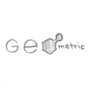
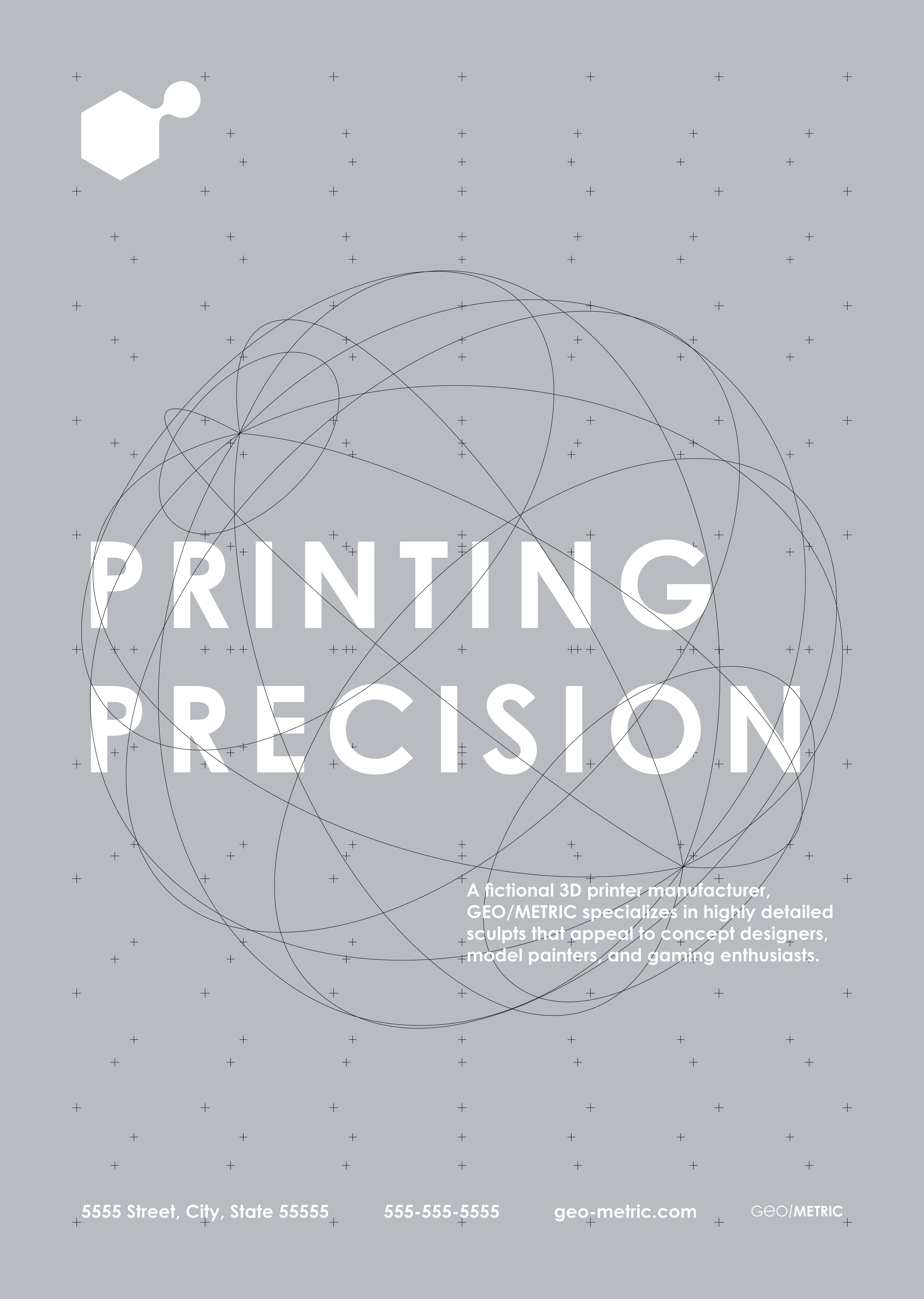
A fictional 3D printer manufacturer, GEO/METRIC specializes in highly detailed sculpts that appeal to concept designers, model painters, and gaming enthusiasts.
mission
The aim of this project was to design a logo with a modern appearance that embodies the innovation of 3D printing with a unique flair to appeal to creative individuals.
etymology
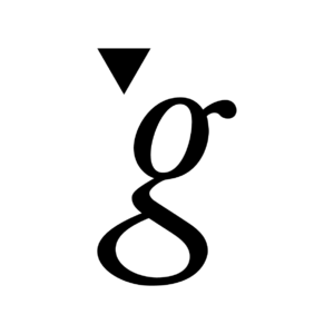
The meaning of words can deeply impact how a product is perceived. GEO/METRIC alludes to technology, precision, and organic matter.
geo = “earth, land” + metric = “measurement”
keywords
creative quality precision
concepting
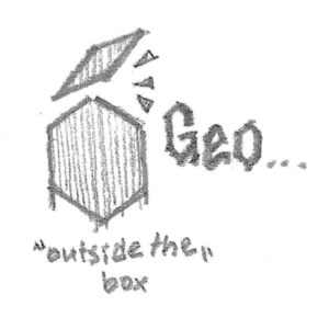
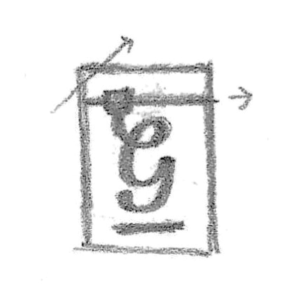
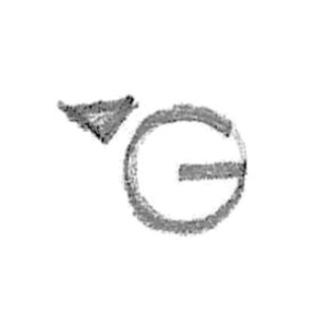
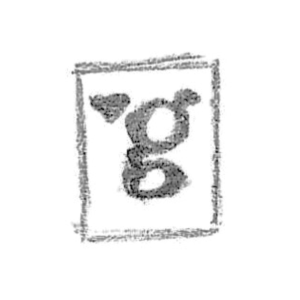
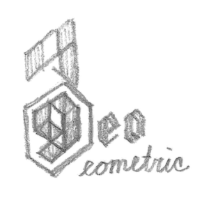
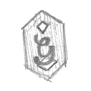
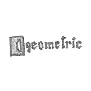
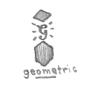
Taking inspiration from the design brief, particular attention was paid to combining technological imagery with a human element.
contrast / symbolism
Some options included integrating sharp geometry with traditional handwriting or synthesizing organic forms with a modern typeface. Consideration was also given to the shape of various machine parts for their potential as powerful iconography.
01
02
03
04
05
06
07
08
09
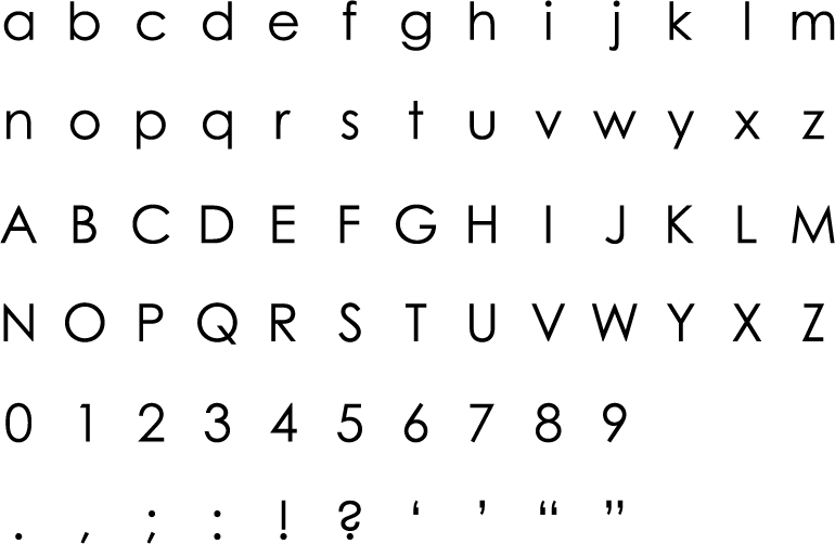
typeface
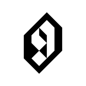
Century Gothic Pro complements a geometric style, and replacing a letter helps complete the theme of circular forms implied in the logo. Furthermore, the round shapes function as a symbol of its content (i.e. geo, meaning “earth”).
color
A monochrome scheme contributes to a clean and reliable aesthetic, and the subtle influence of a cooler temperature hue evokes the idea of technology.
#3d3e40
#797c80
#b6babf
#000000
#FFFFFF
conclusion
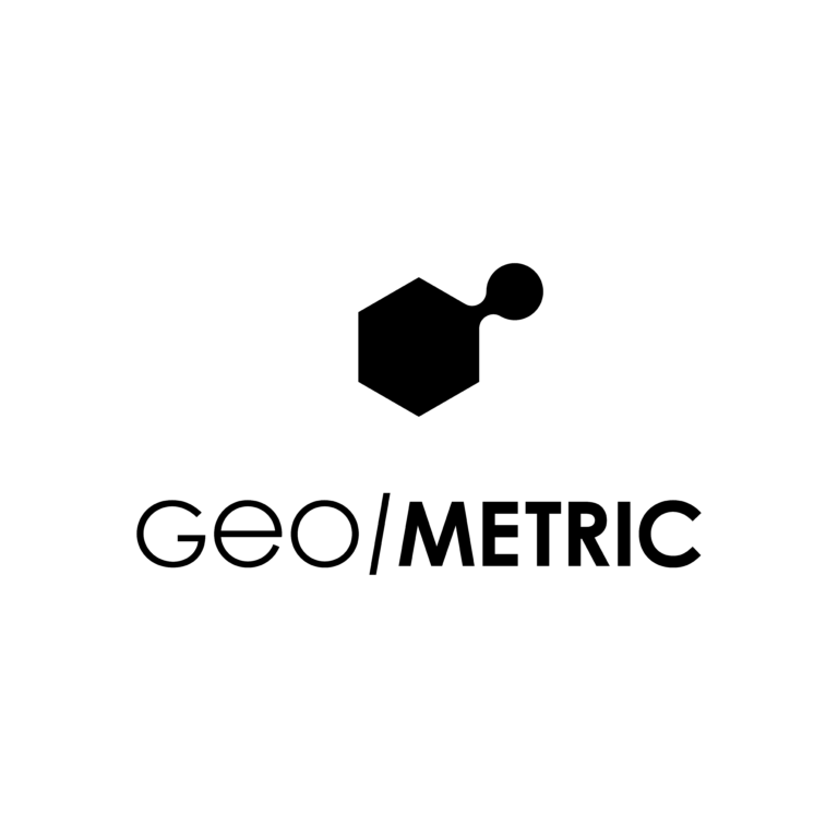
The final logo alludes to the shape of a 3D printer, though it has an organic feature; It captures the precision of complex machinery, yet retains a human quality. Additionally, the combination of rounded and angular lines produces a pleasing contrast.